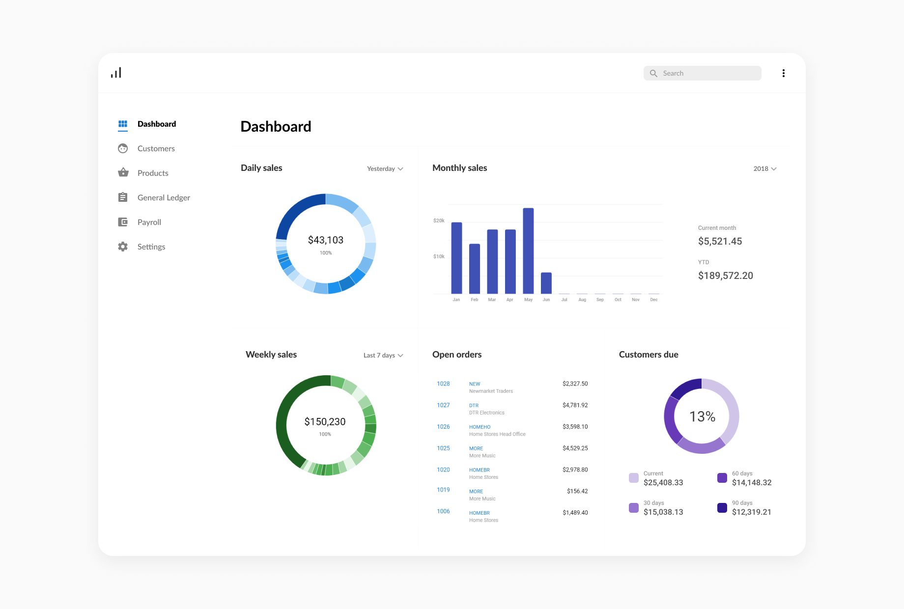
Navigation and Dashboards
Displaying information visually for users

The Problem
Attache is a desktop-based accounting and payroll software that’s helped business owners effectively run their businesses for over three decades. Layers of useful features have been added over time. However, useful functionality was hidden due to poor usability, legacy patterns and a lack of intuitive design. It was time to update the usability and look and feel to unlock the immense value users could enjoy from their product.
The Approach
I worked as part of the UX design team of three, in close collaboration with product managers. Once the product managers decided on the business goal of modernising the product, we identified the following opportunity areas:
New Navigation
Users selected one of three legacy styles - tabs, dropdown menus and a tree-style to launch task screens. Watching people use the existing navigation styles showed many unnecessary clicks. There was also a discoverability issue. Over time, users grew accustomed to navigating to the screens they most used, but had difficulty finding new task screens.
The Landing Page
After logging in, users immediately saw the help centre, and as a team we agreed there was a huge opportunity to use the landing page for people to run their businesses more effectively.
Iterating from wireframes to interactive prototypes
We started out in the UX problem space by interviewing users and stakeholders about their needs, pain points and what info they needed to run their businesses effectively. We quickly began producing wireframes of possible landing pages and navigation styles. Fairly quickly, patterns from user interviews emerged, such as users finding it difficult get a birds-eye view of their business from the software. These findings led us to focus the landing page on dashboards with the aim of helping users do their jobs more efficiently and accurately.
Our wireframes went through many rounds of iteration, incorporating feedback and input from users, stakeholders and partners. During this time we also worked with Engineering to ensure the designs were feasible from a technical perspective.
We turned our wireframes into mock ups of the UI design, then into interactive prototypes for rounds of usability testing.
I built the interactive prototypes in Axure so that we could validate design concepts before even writing a single line of code, reducing waste while gaining confidence we were building the right thing. We asked users questions like “what deliveries do you have coming in today?” to see if they could easily find the information on the dashboard or navigation.
For further feedback, we visited the offices of customers to showcase the designs. We wanted to gauge how excited they were that the product worked better and looked more modern. Thankfully, customers were largely happy and excited about the new release. Many also provided useful feedback that went into the next round of iterations.
Introducing Analytics
One exciting thing for the design and product teams was that we introduced analytics with this project, tracking events such as switching navigation styles. We wanted to gather analytics to determine whether the designs were successful (switching to an older navigation style indicated that a user didn’t like it) and to inform future product decisions.
The Outcome
The work we did to improve the usability and visual design was very well received. The designs were very well received by partners and customers, who often asked when they’d get their hands on it.
The new navigation also quickly became the most used navigation style with 80% of users, providing real data to retire older navigation styles in the near future. The dashboards continue to be rolled out in stages and release cycles. Updating the design, usability and architecture continues to be a constant work in progress for the entire team in an effort to provide value for our users.